When it comes to design, art, or even everyday choices like fashion, color is a powerful tool. One of the most striking techniques in the world of color is using complementary colors. These color pairs, directly opposite each other on the color wheel, are not only visually captivating but also provide a sense of balance and dynamism. This article delves deep into the world of complementary colors, uncovering their significance, applications, and how to use them effectively for the most stunning results.
What Are Complementary Colors?
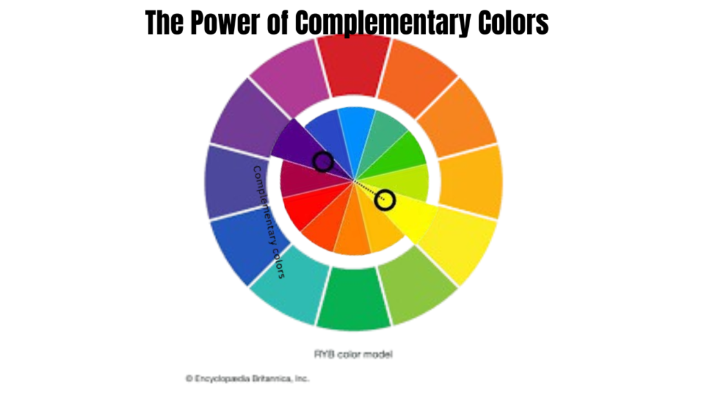
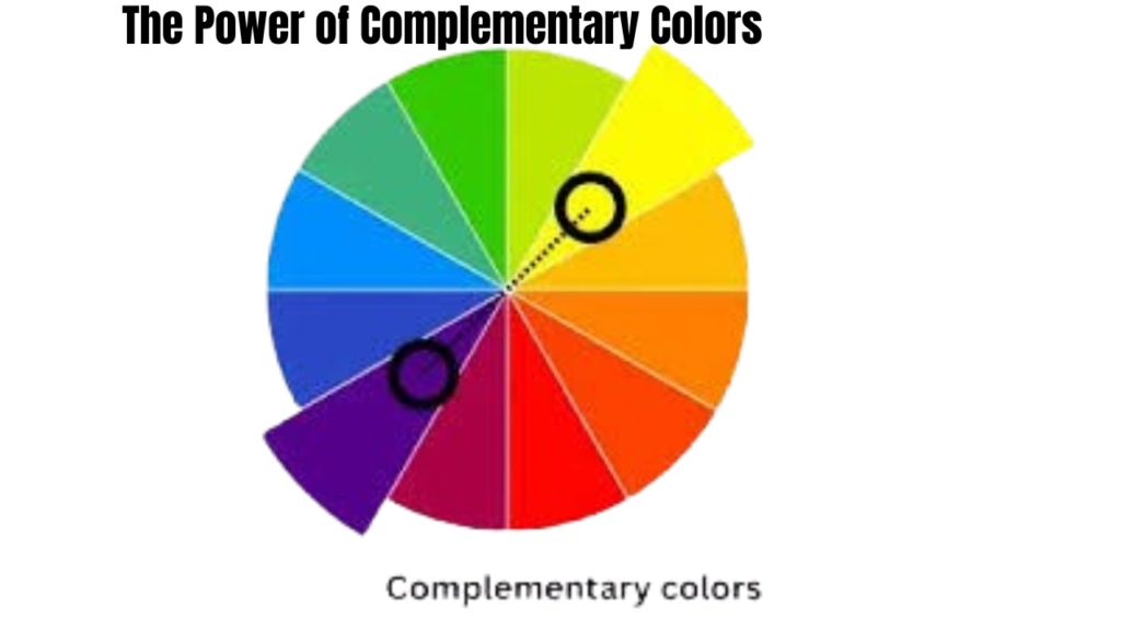
In simple terms, complementary colors are pairs of colors that, when placed side by side, create the most vibrant contrast. The theory is rooted in the color wheel, a tool widely used by artists, designers, and anyone working with visual aesthetics. Common pairs of complementary colors include:
- Red and Green
- Blue and Orange
- Yellow and Purple
When viewed together, these pairs amplify each other’s intensity, creating an effect that is both bold and harmonious.
Why Are Complementary Colors So Impactful?
The science behind complementary colors is fascinating. They are opposites on the color wheel, which means they balance each other out when used together. Here’s why they’re so effective:

1. High Contrast
The sharp difference between complementary colors grabs attention immediately. Whether it’s an orange sunset against a blue sky or a vibrant green leaf next to a red flower, these combinations naturally draw the eye.
2. Mutual Enhancement
When placed side by side, complementary colors intensify each other’s appearance. This means they look brighter and more vibrant together than they would on their own.
3. Emotional Impact
Each color in a complementary pair often carries its own emotional weight. Together, they create a dynamic effect that can evoke strong feelings, making them a favorite in advertisements, logos, and branding.
Using Complementary Colors in Design
While the concept sounds simple, using complementary colors effectively requires a thoughtful approach. Here are some practical ways to integrate them into your designs or daily life:
1. Dominant and Accent Colors
One of the simplest ways to use complementary colors is to choose one as the dominant shade and the other as an accent. For example, in a room, you might paint the walls a calming blue and use orange decor items to create pops of interest.
2. Split Complementary Scheme
If pure complementary combinations feel too bold, consider the split complementary scheme. This involves using one main color and the two colors adjacent to its complement. For instance, instead of pairing blue and orange, try blue with yellow-orange and red-orange for a softer yet visually engaging palette.
3. Triadic Color Scheme
For a balanced yet energetic look, opt for a triadic scheme. This method uses three colors evenly spaced around the color wheel, such as red, yellow, and blue. While not strictly complementary, it allows for dynamic combinations that are easier on the eyes.
Real-Life Applications of Complementary Colors
From interior design to fashion and branding, complementary colors are everywhere. Here’s how they shine in various fields:
1. Interior Design
A well-designed room often relies on complementary tones to create contrast and depth. For example, a navy-blue sofa paired with orange cushions or a yellow accent wall contrasted by purple curtains can add personality to a space.
2. Fashion
In fashion, wearing complementary colors creates striking outfits. Think of a green dress paired with red accessories or blue jeans matched with a burnt-orange jacket.
3. Art and Photography
Artists use complementary tones to draw focus to their subjects. In photography, placing a person in a yellow outfit against a purple background instantly makes them stand out.
4. Branding and Marketing
Brands often rely on complementary shades to create logos that pop. For example, think of a bright orange logo on a blue backdrop—this high contrast ensures the design is both memorable and eye-catching.
Tips for Using Complementary Colors Thoughtfully
While complementary colors are undeniably powerful, using them excessively or carelessly can lead to overwhelming visuals. Here are some tips to keep in mind:
- Start Small: If you’re new to working with colors, use complementary shades sparingly. A few accents can have a big impact.
- Consider Context: Different settings call for different levels of contrast. For example, a soft palette might work better in a bedroom than in a high-energy marketing campaign.
- Balance is Key: Use neutral tones like white, black, or gray to balance the boldness of complementary pairs.
- Experiment: Don’t hesitate to play around with tones and shades of complementary colors. For instance, pairing pastel yellow with lavender offers a subtler contrast than pairing pure yellow with purple.
Why Should You Use Complementary Colors?
Using complementary colors isn’t just about aesthetics—it’s about creating an experience. These color combinations are eco-friendly in the sense that they rely on natural visual harmony. By understanding and applying them, you can create designs that are not only beautiful but also psychologically appealing.
Whether you’re revamping your wardrobe, designing a logo, or redecorating your home, complementary colors offer endless possibilities for creativity and expression.
Also read: M4ufree: An In-Depth Review of Features, Risks, and Alternatives

Final Thoughts
The beauty of complementary colors lies in their versatility and impact. They’ve been used for centuries in art, design, and everyday life to create visuals that resonate deeply with viewers. By mastering the art of pairing complementary tones, you can elevate any project, outfit, or space to a new level of brilliance.
So, the next time you’re faced with a blank canvas or a creative challenge, turn to the color wheel. The perfect pair of complementary colors is waiting to transform your vision into something unforgettable.
4o


Can you be more specific about the content of your article? After reading it, I still have some doubts. Hope you can help me.