
Why Mylar Pouches and Packaging Pouches Are the Perfect Canvas for Nature-Inspired Branding
In a world dominated by fast fashion, digital saturation, and urban stress, a quiet, nostalgic design movement has emerged from the woods: cottagecore.
Characterized by romanticized rural life, hand-touched charm, and earthy beauty, this aesthetic has captured the hearts of Gen Z and Millennials alike.
And now, it’s reshaping how brands design their packaging—especially in the booming space of custom packaging pouches and mylar pouches.
But this isn’t just about slapping a floral print on a pouch. The cottagecore packaging trend taps into emotions: it invites consumers into a slower, more thoughtful world.
For small businesses, indie brands, and designers looking to captivate today’s buyers, leaning into this trend offers both creative and commercial value.
What Is Cottagecore, Really?
Before we dive into packaging, let’s unpack the aesthetic.
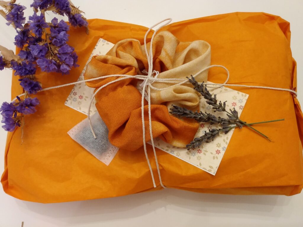
Cottagecore is an idealized vision of rural life: think linen dresses, garden harvests, pressed flowers, warm bread, beeswax candles, and handwritten letters. It’s soft, analog, and romantic—offering an antidote to modern chaos.
Key elements of cottagecore:
- Natural textures (linen, kraft paper, woodgrain)
- Soft color palettes (sage green, dusty rose, butter yellow, cream)
- Vintage or hand-drawn illustrations
- Nature motifs (flowers, herbs, mushrooms, farm animals)
- Homemade, artisanal feel
Now imagine this aesthetic translated into the tactile world of packaging. That’s where things get exciting.
Why Cottagecore Is Perfect for Flexible Packaging
Cottagecore isn’t just a visual style—it’s a feeling. And flexible packaging, like stand-up pouches and mylar bags, can deliver that emotion when designed with intention.
Here’s how:
1. Tactile Texture Mimics Handcrafted Appeal
The softness of matte lamination, the organic look of kraft-style films, or even soft-touch mylar can give pouches a hand-crafted, small-batch feel—even when produced at scale. The result? Packaging that feels like it was made with care.
Tip: Look for matte or textured finishes in your pouch materials to align with the “handmade” narrative.
2. Vintage-Inspired Print Design
Cottagecore draws heavily from vintage botanical illustrations, 19th-century herbarium sheets, and storybook-style artwork.
These intricate visuals look stunning on flexible packaging thanks to modern printing capabilities that allow for full-bleed, high-res graphics on both mylar and poly pouches.
Design motifs that work well:
- Fine ink drawings of wildflowers and insects
- Etched illustrations of farm animals
- Delicate calligraphy or serif typography
- Faux postmarks or hand-inked labels
3. Earthy, Muted Colors That Evoke Calm
Forget neon. Cottagecore packaging works best in muted tones that mimic nature: moss greens, muted lavenders, buttery creams, earthy rusts.
Flexible pouch printing lets you render these shades with high fidelity while preserving vibrancy.
Color palette inspiration:
- Sage, olive, and fern
- Dusty rose and antique mauve
- Pale wheat, oat, and clay
- Sky blue and fog grey
These soft, storybook tones bring warmth and calm to shelves otherwise filled with loud, synthetic branding.
Case Study: How Indie Brands Are Leaning Into Cottagecore With Pouches
Let’s look at how small brands are thriving by using cottagecore as their packaging foundation—especially with mylar pouches.
�� Wildwood Botanicals – Herbal Tea in Kraft-Look Mylar
A boutique apothecary brand, Wildwood Botanicals uses matte kraft-look stand-up pouches for its loose-leaf teas.
Their designs feature vintage etchings of chamomile, lavender, and calendula with cream-toned labels and hand-lettered font styles.
They successfully designed tea packaging bags include a clear window shaped like a leaf—combining function with cottagecore charm.
�� Oak & Honey – Artisan Baking Mixes
This small business packages their gluten-free scone mixes in soft pink and cream custom resealable pouches.
The illustrated packaging features gingham tablecloth patterns and watercolored blackberries. A wax seal-style logo at the top seals the deal, both literally and visually.
�� Meadowmoon Soaps – Natural Skincare Pouches
Meadowmoon’s biodegradable flat pouches use floral and celestial designs to reflect their botanical soap blends. Think lavender sprigs, crescent moons, and vintage script.
They add texture through blind embossing and eco-friendly ink, marrying sustainability with softness.
Designing Your Own Cottagecore Pouch Packaging
Want to tap into this trend for your own product? Here’s how to get it right.
Step 1: Start With the Right Substrate
- Matte mylar: Gives a premium, soft finish
- Recyclable kraft-film: Evokes paper but offers barrier protection
- Soft-touch lamination: Adds a tactile “hand feel”
Step 2: Build a Nature-First Color Palette
Anchor your design in soft neutrals and nature-drawn hues:
- Cream, blush, butter yellow
- Terracotta, sage, dusty blue
- Avoid anything too bright, synthetic, or glossy
Step 3: Choose Illustrations That Whisper, Not Shout
Cottagecore designs tell their story quietly:
- Use botanical or garden elements
- Add texture via hand-drawn lines or pencil sketch effects
- Consider frame borders, like vintage seed packets or recipe cards
Step 4: Add a Personal Touch
- Use calligraphy or serif fonts that feel handwritten
- Add faux “hand-stamped” details
- Try a die-cut window shaped like a flower or fruit
Step 5: Consider Sustainability
Because cottagecore buyers value nature, align your packaging with eco-conscious choices:
- Compostable or recyclable films
- Water-based inks
- Minimal outer packaging
Why It Works: The Psychology Behind the Trend
Cottagecore packaging connects with deeper consumer emotions:
- Nostalgia: It reminds people of simpler times, baking with grandma, or wandering in the countryside.
- Mindfulness: The softness and restraint of the design encourages a slower, more thoughtful experience.
- Authenticity: It feels like it comes from someone’s kitchen, not a boardroom.
- Escape: It offers a breath of calm in the chaos of modern commerce.
This is especially powerful in saturated markets like wellness, snacks, skincare, and handmade goods—where connection often trumps price or even function.
Final Thoughts: Cottagecore as an Intentional Packaging Strategy
Cottagecore isn’t just pretty—it’s strategic. In an age where mass-produced goods feel soulless and impersonal, packaging inspired by nature, craft, and calm can differentiate your brand instantly.
Flexible packaging like mylar pouches and stand-up pouch formats are the perfect medium to bring these whimsical, nature-rooted visions to life—without sacrificing barrier protection or shelf stability.
So, whether you’re a small batch candle maker, an organic granola startup, or an herbal skincare formulator, don’t underestimate the storytelling power of a softly illustrated, beautifully textured pouch.
Your customers aren’t just buying a product. They’re buying a feeling. Make sure your packaging delivers one worth remembering.